The Swiss artist Dieter Roth spent many creative years in Iceland. Some of his greatest contributions to the art world were conceived and between 01950s to 01990s. While you can certainly read more about his art and impact, we were more interested in a story that was circulated between friends. It was such a brilliant twist on the abhorant advertising you see in magazines, it couldn’t have been true.
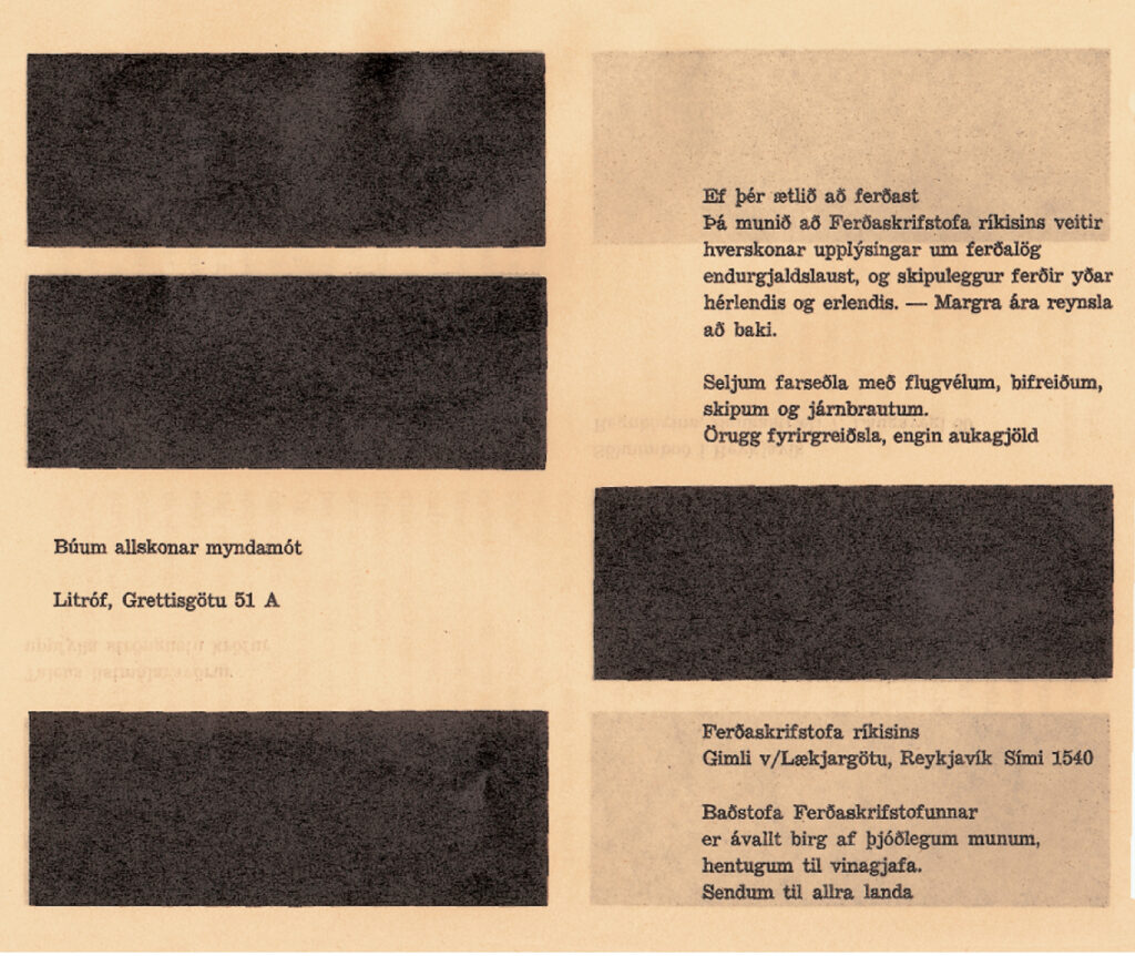
In 01953 Dieter Roth’s publishing company was printing an Icelandic magazine called “Birtingur”. The story goes, that he was so fed-up with the advertisements coming in, that he just typeset them in an incredibly boring way. It was rumored that the small classified box style ads where priced so the more you paid, the higher contrast your ad became. This idea tickled our brain to no end. Imagine all the ads looking the same, in a plain font, the only distingusting feature is the contrast. If you want to be seen in the boring wash of grey, then you need to pay for contrast and clarity. Which is exactly what advertisers do today, buying bigger and bigger ads. Even TV commercials are louder durning the ads to try an get your attention. Setting the pricing model based on greyscale colors was a brilliant way to reset the system.
This idea sounded too good to be true, so we set out to find a copy of the original magazine to confirm. This turned out to be more difficult than expected. We went to a museum which curates his work. While they have many of his pieces, they didn’t have any copies of Birtingur. We were referred to the National Library archives. There is no doubt the library has the right edition, but without actually spending the time to go through everyone issue we were lost. That’s before our random chance encounter with Guðmundur Oddur Magnússon or Goddur as most people know him. He was a student of Dieter Roth’s and knew exactly the ads and magazine issue. Even better, he had a copy and graciously emailed the images.
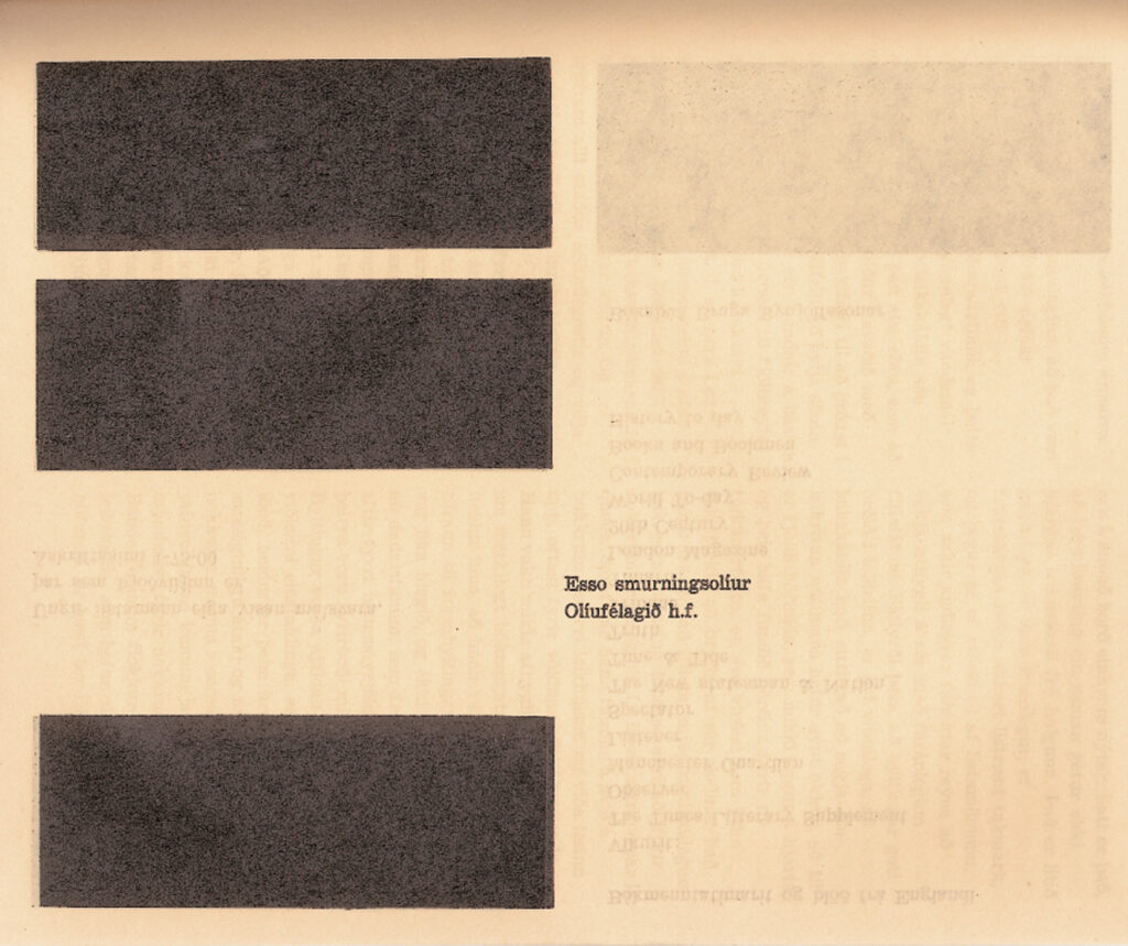
While Dieter Roth did create some radically boring ads for incredibly boring companies, it wasn’t the greyscale pricing idea we had thought it was. The design was black on brown, a boringly typeset message next to anonymous black boxes. Seeing the images tends to capture the sentiment of these companies. To my knowledge, this stunt didn’t go down well. Which is sad in a way, but then also makes this experiment extra special because it is unique.
Even though the legend of the greyscale pricing by Dieter Roth turns out not to be true, it does create an opportunity to create such a greyscale ad buying scheme.
Rather than pay for space, where bigger costs more, everyone gets equal size, but you pay for contrast and legibility. It is a fascinating way to think about constraints. When you can simply keep adding pages to a newspaper, bigger costs more, but with situations where adding more is impossible, customers pay for something else. That could be contrast.
Addendum
The Icelandic National Library runs a website called Timarit.is which indexes various print publications and hosts them online.
Birtingur is available to browse and search online. You can view scans of the monochrome ads that were run in the two issues in 01957.
Back in 02017, we hosted our first Material Conference. Goddur (the only person we know with his own emoticon: iii];彡) presented. You can watch the presentation and read a bit of back ground in our previous post: Fine Art ingredient of the Web. We introduced Goddur with the story about Dieter Roth’s ads and the first few minutes of his talk were about his connection to Dieter.
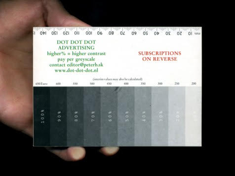
We’ve discuss this story before in various places and Peter Bilak sent us this photo of how they did greyscale pricing back in 02002!