Writing again and still. This was a week full of different projects. We continue to collect and analyze data about VR entertainment and pass them along to potential clients.
Grants
We had several interesting meetings this week to. All regarding the same thing from various angles. The EU is offering a series of different grants in a collection called Horizon 2020. One team we are working with already has a phase I grant. That was used to produce a feasibility study and now they’re working on the Phase II grant application. So we had a meeting with the EU representative regarding how and what we can use as our 30% matching contribution. Another team we’re helping is also considering applying for one of the medical research grants. So we had a meeting with yet a different organization which helps apply for these types of grants. Finally, after reviewing the potential research grant offerings, a third team we’re helping sees one that is exactly what they do and was on their roadmap. Therefore, we’ve started to collect data and planned out the next steps to apply.
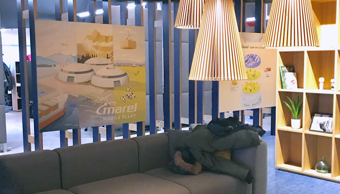
In a less grant oriented work block, we met up with Marel, which we did some work for several months ago in the form of a future predictions workshop. That was back in May 02017. As part of that workshop we teamed up with Jon Hicks from Hicksdesign to create some artwork based on some of the findings. These are in no way a roadmap or future products, but having the artwork hung in their office means that people will see it on a daily basis and maybe, just maybe life will imitate art and some related product will appear.
The designs came out great and process was a lot of fun. If you or our team wants to do a half-day workshop and help think out the future, get in touch.
Back in #week 360 we managed to put together some shelves in our new office space and this week we began to fill them. With all these meetings and onsite visits, it is a slow move-in process, but it is getting cozy.
“Average companies use averages”
—Ben Lorica
Part of these week was spent on a client product looking into medical survey results. The idea being that you get results compared to others who’ve taken the same survey.
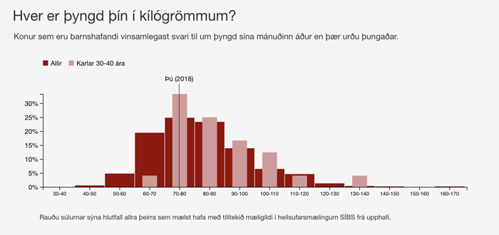
There are several important piece of data here. Had we simply gone with averages, this would have been very misleading. The red-bars in the back represent all the people who have taken this health survey. It is VERY important to note that this is a self-selected survey, not a random sample and does NOT accurately represent Iceland as a whole. The lighter, pink bars, represent the demographic which most represents you, Males 30-40 years old. In this example, the person (Þú) is in the 70-80 kg bucket. Had we averaged all the red bars, this person would be below average, but when we break it out as a distribution and subcategories of Male 30-40, we can see a different story. Not only is this person below average for everyone, but also for their subgroup, but we can also see that it is actually the most popular bucket for Males 30-40, and that some outliers are what would be increasing the mean average.
We’ve spent a lot of time and iterations improving these charts as to not simply boil it down to a single number while at the same time not trying to overwhelm the reader with too much data. We’ll continue to iterate on the design, but there is always the over-arching issue that the results aren’t what you should rely on for healthy life choices. Just because you are below average weight, you are actually below average weight of the people who attended the health inspection. That doesn’t mean you might still be above a recommended healthy weight.
You always need to be careful when offering relative comparisons since the data you might be comparing yourself too, itself might not be average!
Bric-à-brac
I wouldn’t call these “Intelligent” since they are simply using the rules of non-newtonian fluids. There is no “Smarts” to them, the smarts came in using this physical material in this application. Once you get over the marketing buzzwords, it is actually an interesting idea. At low speeds, the liquid squishes out of the way so the vehicle barely feels the bump, but if you are hitting the object at high-speeds, the liquid becomes ridged and it feels much more like a bump. It is strange to watch this video with the shiny, futuristic women trying to demonstrate non-newtonian fluids. In this current climate something feels very strange choosing to demonstrate physics in this way. All a bit too “Booth babes“.