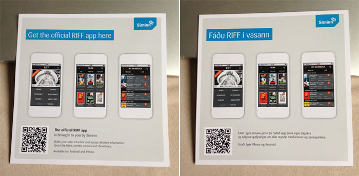
Starting sept 26th, the Reykjavik International Film Fest or RIFF will be kicking off. So today, I stopped by their pop-up ticket office to pick-up a brochure and have a look around. RIFF has a great line-up of films over a ten day period, a guide is essential. The website now has the program online, but as a PDF which is embedded inside some PDF viewer supplied by a 3rd party company. Firstly, this is a professional film fest, without a program online in HTML for people to actually use, bookmark, copy and paste or favorite any events, that is a failure to address your audience’s needs. The way they plan to “solve” the problem is with their mobile app. At the ticket office they had some nice fliers in English and Icelandic for their new “official RIFF app”. I picked-up the flier and was appalled at how badly something like this could have been made.
The quality, layout and design are all fine. It is professionally laid-out in two languages. The problem is that they missed the point and opportunities on so many fronts! In this article, we’ll have a look at everything they got wrong and how you can avoid it and improve any fliers you might be making the future.
We’ll start at the top. In Icelandic, the title is “Fáðu RIFF í Vassann”, which translates roughly in to “Get RIFF in your pocket”. It is a catchy title. Now let’s see what it is in English: “Get the official RIFF app here”. A bit strange that the text is different between translations, but OK, you need to localize and change things. My biggest point of confusion and contention is the word “HERE”. For years on the web we’ve been told to NOT say “click here”. There are problems with accessibility when every link is read out as “click here”, “click here”, “click here”. Not to mention clicking is a mouse/pointer action not a tapping figure gesture. Your links should always be descriptive of what they do and make sense out of context, like when printed. You can’t “click here” on a piece of paper, it interrupts the flow of reading and is a rookie mistake. (I know that research shows that people are more apt to click something that says “click here”. Atleast meet people have way and link the full descriptive text “click here for information about X”)
But let’s get back to the flier. Why, oh why does it say “get the official RIFF app here”? Here, where? At the ticket office, not from the paper? Where is the HERE you mean? This could have easily been fixed by saying “Get the official RIFF app online” or “… at the iTunes store” or “… from our website”. It doesn’t take a copy editing genius to fix or offer up alternatives that make sense.
When in print, never say “HERE”, you can replace it with something that is much more descriptive. It is lazy to use terms like ‘here’ or ‘there’, even online you should always think about being more descriptive. You don’t need to treat your readers like a child, hand holding them all the time, but you do need to be explanatory in your use of adverbs.
As we move down the flier, we see 3 very nice white iPhones (all with bizzarely different times and with no button or speaker) with some examples of the app. Fine, no problems here, nice preview of what you’ll get when you download the app.
This brings-up the whole discussion of whether or not this even needs to be an app. I won’t go into all the details, but the minute you couple yourself to an app, which is a proprietary technology, you are at the whims of the device creators. If Apple doesn’t like you app for any reason, you are dead. If you movie has a tiny bit of nudity, your app could get rejected from the store. Websites do not have this problem. You can update a website any time you like without permission from the device creators. The other great thing about websites is that they work on more than just the newest versions of OSes of the newest versions of smart phones. And if your app needs to go online to fetch data anyway, you have really just built a custom browser at a much higher expense than a web developer. Technologies such as local storage and app cache can get your webpage to run offline and mimic an app. The difference between apps and websites is an article or two by itself.
As we move further down the flier we see a QR code. I love the idea of QR codes, but in practice they are a disaster. I’ve written about them before in previous articles called “What are 2D barcodes” and “What 2D barcodes aren’t” and this flier fails the test. It says:
That’s it. No more. So that “Get the official RIFF app here”… we still have no idea where HERE is. No URL, no mention of a website, no mention of any place to go download it. Just a big, uninviting QR code.
I’m a pretty tech-savvy guy, but I don’t even have a QR code reader on my phone. I understand the technology, I can create QR codes and I can’t even be bothered to download an app to decode them. The average person now needs to download an app to read the QR code to go download an app! That’s insane.
I know the phone company did a big push a few years ago where they bought ads space through out the local newspaper Morgunblaðið and sent it to everyone’s home for free. It was a corporately underwritten newspaper as an advert with news articles in between the phone company’s QR code push. That was their adoption push and they’ll probably fall back on that saying “People know what QR codes are now”. But that logic makes no sense. People know where your office is and they have called you on the phone, but yet you still put your address and phone number on all your business cards, letter head and other print information! There is zero explanation of what that QR is on this flier, what it does or how you are suppose to interact with it. From a user experience and interaction point of view, you might as well not even have that QR code if you aren’t going to explain or help the reader get to the point where they can decode it.
The whole point of this ad is to get people to download the app and ~1/16 of the flier is the QR with no explanation of how to use it.
If you are going to use up the space to put an ugly machine readable QR code in my face, plus now some explanation text to tell me what a QR code is, how to download an app to scan it to download your app, wouldn’t it be MUCH better for everyone to have simply put a URL there? Something like, “To download our RIFF app, please visit http://exmaple.com/mobile” or something. Then you can redirect people to the right platform.
In fact, let’s look at this from marketing point of view and see all the opportunities. A person picks-up the flier and wants to download your app. You have people who are very interested in your product, they want to give you money, in fact they want to learn more about your events so they can give you even more money. So what do you do? Confuse them with the QR code, then send them off to some 3rd party site to download your app!
Let’s think about that for a moment. What if we had a URL that ANYONE, not just smart phone users could visit? On that page, have links for the smart phone folks to go download the app. On this landing page, you control the branding, the experience, but wait, while they are on the site, why not let them know about discount passes, the mailing list, and the plethora of other things you want to get in front of your customers. That makes sense. Spinning them around and pushing them to a 3rd party sites doesn’t. It is a missed opportunity to engage with your fans.
Beyond the app idea versus webpage, there is an often overlooked technology called “A calendar file”. You can download ICS files which work in any calendaring application. This means you could browse RIFF on your desktop calendar app (Microsoft Outlook), an online calendar app (Google calendar), your phone’s calendar or anything that accepts ICS files. It is trivial to create an ICS and sure, it doesn’t have all the fancy swooshes of a mobile app, but it works and people can consume it and remix it into their workflow.
An app is an interruption, you need to remember to look at it, to download it, to deal with the settings, notifications and preferences. An ICS file works itself into the routine you already have, it is more flexible and passive. It isn’t as sexy, but then sometimes the most useful things in life are the ones you don’t notice.
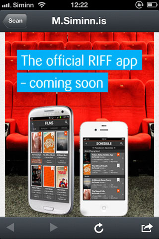
In fairness, I did go online and download a QR reader and scanned the QR code on the flier and this was the result:

Coming soon. They have 4 days before the event starts. I bet this is a recycled app from Síminn’s AirWaves app, and it is waiting for approval from Apple. A part of me says if this had been a webpage, it would be ready by now.
What we’ve learnt to prevent this from happening to you
- Avoid the word “Here”, be descriptive in what you mean. Hire a copy editor. Apple has done a great job with catchy writing, from talking about their new Retina displays as “resolutionary” to the help manuals of their touch devices being called “Finger tips”. They are little phrases that make you smile. “Get RIFF in your pocket” is so much better than “Get the official app here”. Micro copy editing isn’t easy, try writing something short and catch and see if you can do even better than the RIFF headline.
- QR codes are a disaster. They are designed for machines, not humans. Just use a printed URL. The benefits out way the techy-side of barcodes. Printed text is more accessible to more people, it is human friendly and improves the branding much more than black and white squares.
- App versus Webpage? Depending on your needs, a webpage is probably suitable. You can make webpages work offline, look just like an app, it’s much cheaper to develop and work across more devices than just “iPhone and Android”.
All of these points are designed to increase your brand. It isn’t an anti-technology rant, it is about putting customers first, by being more inclusive to your audience and reinforcing your business.
Let’s think about what it means to try and use your services. Avoid cryptic technologies, don’t use them because they are cool, use things that work, work well, and work across as many devices and platforms as possible. The goal of your flier isn’t to show off how smart and cool you are, but to make your customers feel smart and empowered. If your they aren’t doing that, it’s time to rethink the design and start over.

Nice rant, Brian. Good points coming from a very valid perspective: the customer’s!