Ben is a geographer who works on spatial data analysis and geovisualisation. His research interests include social and spatial inequalities, humanity’s impact on Earth, global sustainability and new concepts for the visualisation of these issues. Ben works at the University of Iceland and is a research associate at the University of Oxford. He is also involved in the Worldmapper project which will be the main focus of his talk. The talk will make us rediscover maps with novel cartographic approaches. Be prepared to see the world as you’ve never seen it before!
Because…
Before Google Maps were common place, we forget how bad of an experience the alternatives presented. With each click to pan in a direction or zoom, everything was reloaded. On slow connection it was tedious at best. Then Google Maps started to AJAX in map tiles in the background. You could pan or zoom in place and it felt like magic! Today it is common place, but at the time it was revolutionary.
Maps are a big part of the Web. We are using them constantly, but are we using them correctly? Benjamin is an accidental cartographer who we wanted to come and explain some of his data visualisations using maps.
Much of the work he does at WorldMapper couldn’t happen if it were analog. In his presentation he explains why going digital on the Web is the future of the atlas.
Maps ➞ Web
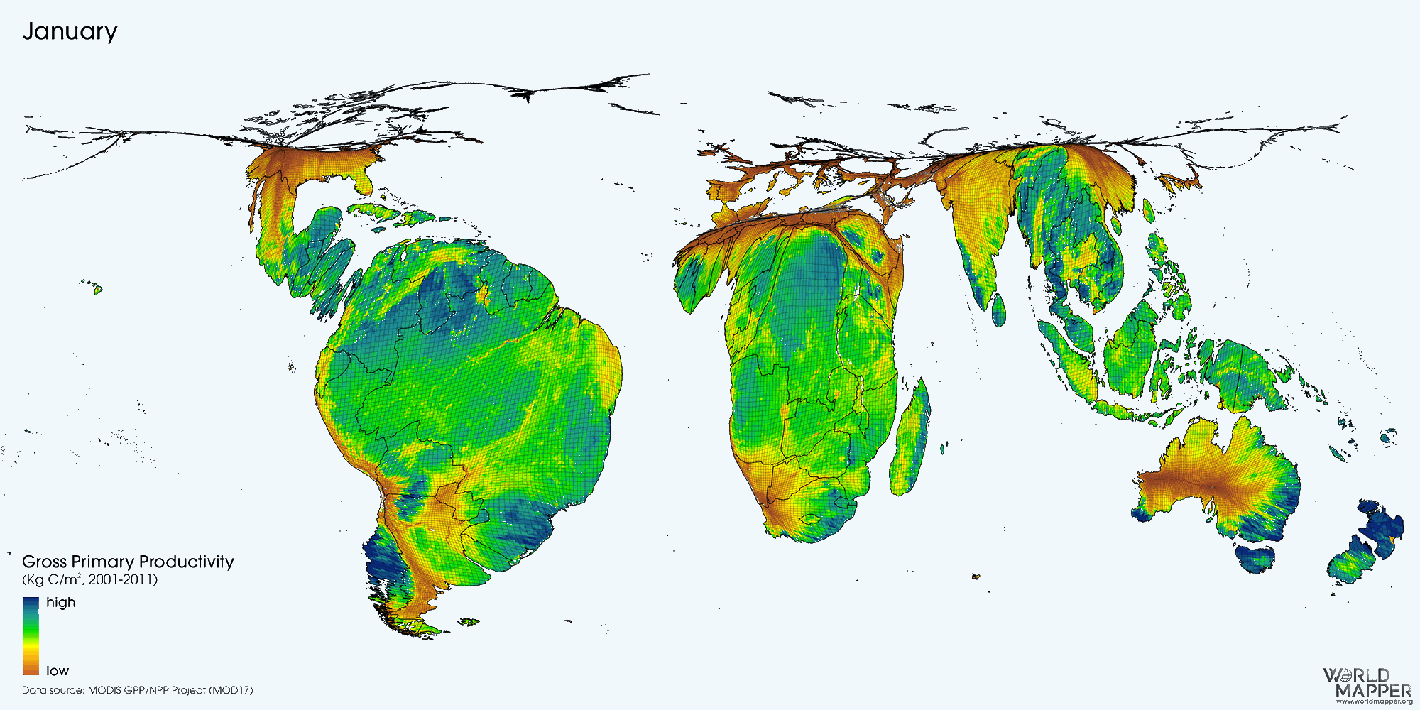
Benjamin and the folks at Worldmapper are focused on creating cartograms. These are specialised maps which combine geographic data with numeric data, normally distorting the “normal” view of the landmasses. At first glance we think that this might be blasphemous to change the shape of the countries, but he makes that point that no matter what map projection we choose, nothing will be perfect. It always has some underlying bias or agenda.
He presents one way to view world population data as a pie chart. China and India completely dominate the pie chart so much, that it is a horrible way to see the population of any of the rest of the world’s countries.
These cartograms are pie charts for cartography. They are purposefully meshing and distorting the landmasses based on the weighted value. The same India and China values applied to map make those landmasses bigger and other countries, like Iceland, tiny.
He cites several examples of where other traditional maps seem to trick us. The images of the world at night were areas of the US and most of Europe are bathed in light from street lamps, cars and buildings. It wrongfully implies denser populations where there is more light. Using a cartogram on that same image, portions of Africa, without power are more better represented in their density.
He also shows an amazing animation of the distortion of landmass based on rainfall. It’s called Nature’s Heartbeat and we can see over the months each of the hemisphere go through their seasonal changes like a pumping heart.
While these cartograms could and are available in analog form, Benjamin talks about the power of them being digital on the Web.
This new Digital Atlas as many powers over conventional versions. The Web brings interactivity not available on paper. Any reader can zoom in for a closer look. It also means that the whole collection can be searchable and curated in a way that can’t be done in print. As new data is available, maps can be updated or linked together, stories and articles applied to them. They can be added to collections, tagged, combined and recombined in different ways. No one map is only in one place.
The pendulum swings both ways too. The Digital Atlas only exists because organisations like the World Bank, UN and other governmental agencies put the data online. This Digital Availability drives new and innovative ideas like Worldmapper. Without it, so many things would never exist.
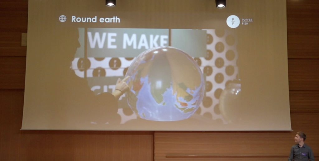
Working with a Scottish company called Puffer Fish. Worldmapper have returned their cartograms back onto a globe. It is amazing to take the interactivity we all know as a child of spinning a globe and seeing all the places on Earth, but now in a digital fashion. The ability to reskin the spherical screen with a new cartogram, click, pan, zoom and spin. We’re taking the digital back to the tactile analog world.
This cross-over is the interesting and amazing experience which is possible when you examine and take the best parts of digital and use that as a building material for something much more.
You can view all the video recordings and subscribe to the Material podcast on the Material Archive site.