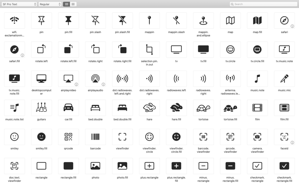
Recently, Apple released iOS13, which included a new symbol font called ‘SF Symbols’. It is a font with lots of commonly used interface glyphs. These are things like upload, download, boxes, icons, actions, etc.
Several years ago, we wrote a book entitled Creating Symbol Fonts (you can download the eBook for free). At the time, there was a tipping point between creating vector glyphs as a font, which was supported as far back as IE6, or moving to SVGs which were only starting to be supported at the time of the book. Overall, for the Web, SVG has won out for all sorts of reasons (color, accessibility, ease of use/creation, but that’s another article for another day).
We’ve now come full circle and are back to creating symbol fonts inside an app. This was probably the easiest and most compact way for Apple to get hundreds of glyphs easily referencable into their existing framework.
Naturally, when SF Symbols was announced we got excited about the possibilities! Officially, the font is restricted for when, where and for what it can be used. Even certain glyphs can only be used for very specific use-cases. But that doesn’t stop us from exploring the possibilities.
Apple did the right thing and added all these icons in the glyphs higher-up in the Unicode set. They don’t clash with existing characters, so their semantic meaning is not confused.
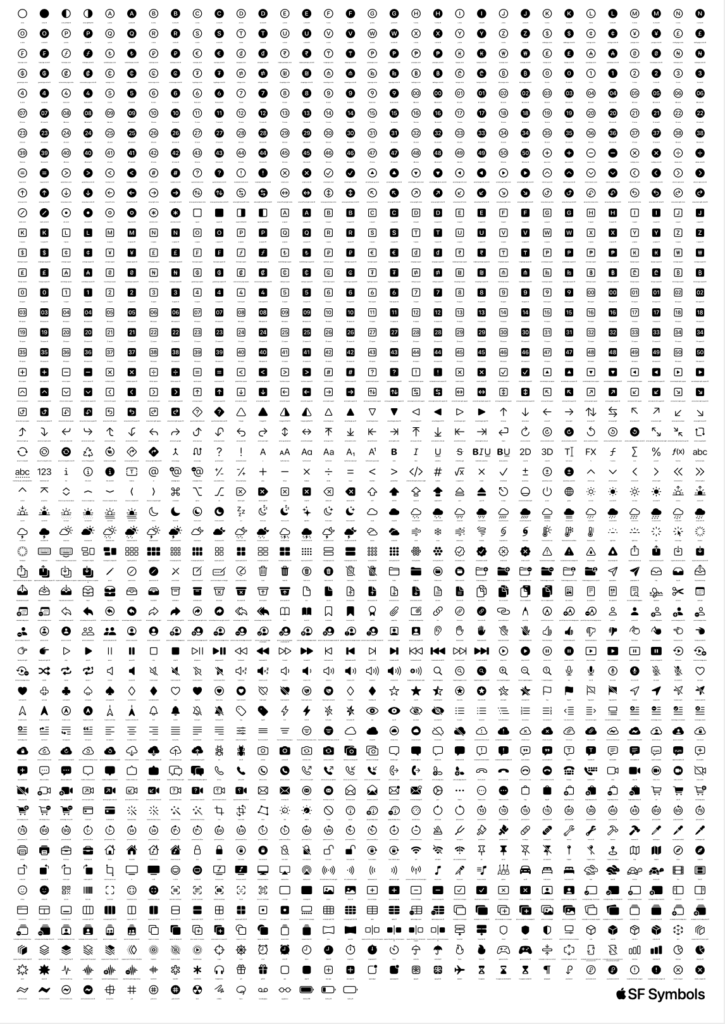
Apple released an app which allows you to browse all of the icons, export and manipulate them. What we wanted was an offline poster which listed all the possibilities so we could get a better overview.
Todo this, we set to work writing a little bit of code. We knew the Unicode range where these icons would be present, so using HTML we output a list of all the hex values in that range and set the font-family to SF Symbols.
<?php
for($i=1048576;$i<=1050434;$i++){
     $h = (string)dechex($i);
     echo '<table>
		<tr>
			<td class="icon">&#x'.$h.';</td>
		</tr>
		<tr>
			<td class="name">'.get_name($i).'</td>
		</tr>
	</table>';
}
?>
With a bit more CSS, we created a grid of all the possible icons all floated and nicely wrapping into columns.
<style>
@font-face {
     font-family: t4;
     src:url("SF-Pro-Rounded-Regular.otf");
 }
 body { font-size: 10px; margin: 0 auto; text-align: center; }
 td { font-size: 8px; text-align: center; padding: 0; margin: 0; }
 tr { padding: 0; margin: 0;  }
 .name { font-size: 7.25px; font-family: t4; height: 20px; vertical-align: top; }
 .codepoint { font-size: 6px; font-family: t4; color: #666;}
 table { float: left; width: 90px; margin: 0; padding: 0; border-spacing: 0px;
     border-collapse: separate; overflow: hidden;}
 .icon {font-family: t4; font-size: 42px; line-height: 72px;}
</style>
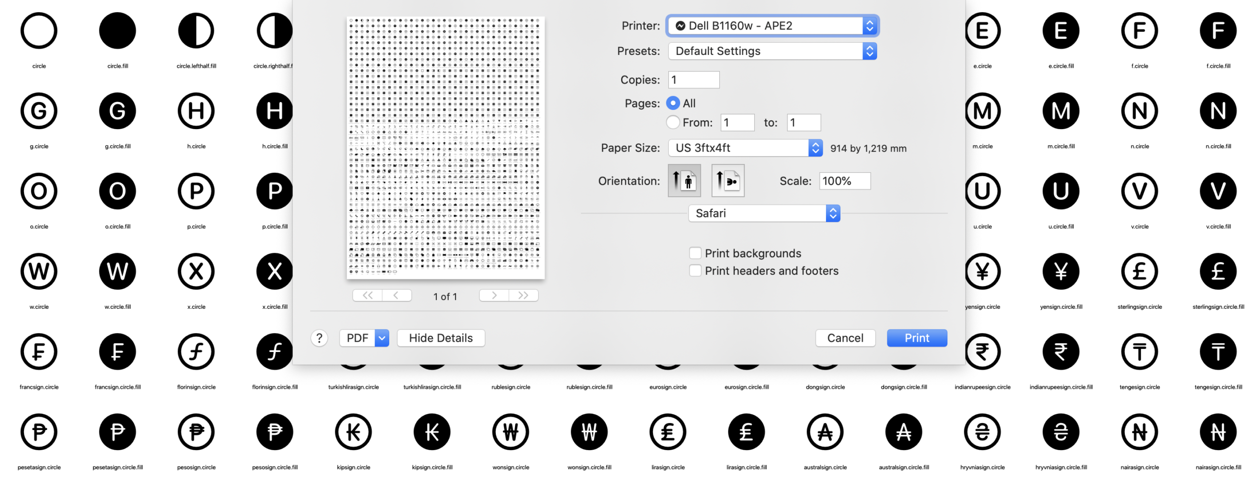
Changing the values in CSS made it very easy to convert from a US 3ft by 4ft poster to an A0. By changing the dimensions of the container, all the icons would flow naturally into rows and columns to fit the desired output size. We could also easily adjust the font-size if we needed to eek out some extra room here or there.
Once we had an HTML webpage set for a poster size, we could make that into a print-ready PDF by ‘printing’ the webpage as PDF. No need for any tools like Illustrator or Sketch todo the initial layout, that was all done in HTML and CSS.
Digital Archaeology
In the process of creating the poster, we found some interesting things. As we looped through all the possible glyph values from the lowest to the highest, it turns out that there are lots of gaps and some icons are not exactly next to the ones you’d expect.
We can speculate that the gaps are, or were, reserved for icons that didn’t make the cut. Maybe these are future product ideas, maybe the design just didn’t work and it got pulled at the last minute?
As for the icons you’d expect to be together but aren’t, well, that’s probably the age-old problem of starting by assigning all the spaces, then realising you needed something more. The only free space is at the end so things get jumbled-up. For most people, that doesn’t matter because they are searching by the glyph name, which can easily be sorted, filters and searched. You only really notice it when they are listed in unicode order.
What this meant for our code was that we had to have a bunch of exceptions to skip over these gaps. As we looped over the full range of Unicode code points, when we were getting no glyph, we made a list of where the gaps started and stopped to skip over those values.
We also have another list mapping the unicode value to the name of the glyph. That way we can create nice labels. Having all these lists means updating the poster in the future should be easier. Apple will no doubt add more icons to the end of the list and potential deprecate some in the future.
SF Symbols 1.1
While we were writing this article, Apple released SF Symbols 1.1. Luckily, we had all the code in place and we could quickly update everything. They added roughly 100 new icons. Some filled gaps, others were appended to the end. It also seems there are a few that are not officially in their SF Symbols app either. (Nothing suspicious, probably an oversight). All in all, the glyphs that were added were mostly circle variants of existing glyphs. Then a bunch of new of icons such as hifispeaker and sportscourt.
We have since updated our code and output to reflect SF Symbols 1.1 glyphs.
Get the Poster
We’ve published all the code to create your own posters on GitHub. Legally, we can’t distribute the font or poster, but there’s nothing stopping you from downloading the font and our code, then tweaking the PHP code, CSS or HTML layout and running it to make your own version for any print-size you want.