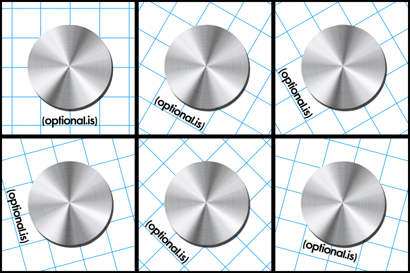
Apple has recently released a demo of their new iOS6 operating system. While people love or hate the new features, there is one specific attention to detail worth calling out.  In the new iOS, there are several metallic style buttons and sliders. This in itself isn’t that spectacular, Apple is know for trying to make things in the digital world look exactly like things in the real world. These are called skeuomorphs and people tend to fall on one side or the other of their usefulness. These metallic buttons have a nice reflection from a light-source above. They always have, but in iOS6, they have connected the reflection on the GUI widgets to the accelerometer. As you tip and tilt the phone, the reflection continues to rotate and change, just as it would in real life.
Part of me says, “Wow, that’s attention to detail”, another part is thinking “What a waste of CPU cycles. They could have made the battery life longer, the memory footprint smaller and the rendering even faster if they weren’t wasting time updating the reflection on a button”, then a third part of me thinks that these sorts of new features have diminishing returns. It is an awesome new “feature” now, but as it becomes standard, we only notice it when it doesn’t change the reflection.
The Kano Model is the framework which helps you plot where your feature is located on the larger plane and helps you realise when it excites versus when it is status quo. Intercom.io’s article “Sustainable advantages for start-ups” describes how, over time, a great new feature becomes a basic expectation.
Jef Raskin, an old Apple and IBM employee, is quoted as saying, “To the user, the interface is the product”.
The interface as the product versus the actual code or device is an important distinction, because we programmers, designers, usability experts see the world through our own lenses. As developers we complain about performance, as designers we complain about skeuomorphs, as usability experts we complain about other aspects to the design. At the end of the day, we’re not the customer. It is the millions of house-wives that buy the iOS devices because they are shinny. They never install apps or back-up their data (which is why there is a big push for iCloud and wireless syncing). To the end-user, the interface is the product. Not the tech specs, not the features, not phone provider, just the interface. Which is why you constantly see this cargo cult in design, trying to copy interfaces. The end-product is certainly more than the interface in the big picture value chain, but to most people, they don’t care. Having an awesome interface is necessary, but not sufficient for success.
Strangely, iOS6’s use of the accelerometer to augment the interface isn’t the first example. The Square app apparently did something similar well before iOS6. (I have the square app, I have a US bank account, I have a square account, but can never use the service because it is geographically locked to ONLY work inside the USA, so I can’t confirm.)
As devices such as the iPhone take off in popularity, we have the issue of touch interactions only occurring through a single shiny piece of flat glass. I know there are efforts to create tactile interfaces that morph and change, but for now, we have a gliseningly smooth surface. I bet this is partly why Apple is so keen on making it look like the physical counter part. We did this with early computers too, buttons look like real buttons, you can press them and they depress on the screen. It gives users feedback about their actions, which is a good thing. We have checkboxes and radio buttons which are also throw backs to an earlier analogue era.
Someone once remarked that there were only about 4 people in the world who know how a scroll bar is properly designed and they are all dead. If you think about the scroll bar on your computer window, there are hundreds of tiny interactions and thoughts that need to be taken into account. The size of the slider, when happens when you click on different parts, the bar, the button, the slider itself. The time and energy getting sliders wrong in early computers is all institutional knowledge built-up over years and years of mistakes. No one should try to re-invent the slider, they’ll just get it wrong! Which brings me to the reflection on these metallic buttons. There is a wealth of knowledge that goes into these, but are we actually paying attention to it?
 3D button design has been around for awhile. On a two dimensional surface such as a screen, we can “fake” 3D by adding shadows and tricking our eye and brain into thinking there is depth when there really isn’t. Just take a look at any button, the bottom will be darker or have a thicker boarder than the top. This is because throughout our evolution, we have been walking around the savannah looking at 3D objects with the sun shining down from above. This makes the top of the object lighter and the bottom darker due to shadows and indirect lighting. This simple heuristic is what our eye transmits to the brain to process a 3 dimensional shape in our field of view. Buttons in our computer interfaces are faking that to make them more tactile than they really are. They are just a set of x, y coordinates which correspond to a function, but that doesn’t sound as appealing as “button”. Have you ever seen a button where it is darker on top than on the bottom?
On a side note, some objects have evolved to counter act this heuristic. Gazelles and other prey (and their predators) have evolved a lighter coloured belly and a darker coloured top. As evolution suggests, when the colour balance is intverted (dark on top, light on the bottom), plus the addition of sun light from above, the dark-light fur becomes more mid-mid when the sun and shadow are summed up. The effect is that the animal looks “flatter” not so 3D and hopefully predators and prey will have a harder time spotting each other. While it isn’t making the animal instantly 2D, every little bit helps in the wild kingdom. It is one example of nature evolving to counteract what Apple and others are trying simulate.
 With more and more sensors in our devices, we can further augment these buttons to give them more than just a 3D feel, by starting to breath life into them. They are not a static paintings, but rather something “real”, it behaves and reacts to me and the environment. It knows what I know, as my point of view changes, the button too reacts and changes.
There is a really intersting book called Metaphors we live by, by George Lakoff. He is a congative scientist dealing with how we use and frame language. In the book he talks about some of the directional words we use in language and how they are associated to different feelings. For instance, “Up” is good and “Down” is bad. When we say things like “I’m feeling up” or “I’m feeling down”, we don’t actually feel up or down, but they are place holder words for good and bad.
As GUI widgets and other aspects of the user interface take advantage of the accelerometers and orientation of the device, will they take into consideration these directional terms and their implied meanings? And from who’s point of view will they focus? The shine on the metallic buttons simply keeps it’s “upward” orientation, so the change in angle of the shine will always be relative to your point of view. The difference is, in real-life when you move your head side to side the shine will move too, but in the virtual world where this is “faked”, we can’t change the shine or parallax or anything else when you move. Atleast not yet. Johnny Chung Lee has done some amazing stuff with the Nintendo Wii and sensors to change the screen based on your movement, but right now iOS6 can only change the screen based on its movement, not yours.
As our devices are packed with more and more sensors, it is logical that they becomes used for secondary purposes. Your iPhone can speak bluetooth, wifi and cellular, has a compass to tell which way its facing, a light sensor to detect if the phone is against your face or in low lighting, it has two cameras (three eyes in total), speakers and a microphone to listen and talk, a touch surface and some accelerometers to gauge balance. Putting all of these to work in unique ways to improve the experience certainly sets the bar very high. Previously, your laptop had a low-light sensor, maybe an accelerometer to lock the hard drive if you drop the machine, 1 web cam, a keyboard and trackpad. In the future we might see NFC (Near Field Communications) such as RFID, air quality sensors, radar/sonar/lidar to detect objects in the dark or convert them to a 3D representation. While this seams to be incredibly wasteful use of CPU cycles, the price of the sensors and hardware is halving every 18 month. What is wasteful today is cheap next year and expendable the year after that. If by tapping into these additional senses to improve the customers’ experience, I welcome the exciting new and interesting virtual worlds we’ll contain in our tiny devices.