On November 14th, 02009 Iceland played host to a grassroots vision planning session consisting of ~0.5% of the nation. It was called Þjóðfundur, which roughly translates into “National Meeting”.  The entire Saturday was spent in Laugardalshöll planning and preparing for the future of a nation. I have my own reservations about the usefulness of these sorts of massive corporate style vision planning sessions and about all the parts of the planning that were removed. All the hard questions were never addressed because organizers wanted people to go away happy rather than spend the day unproductively infighting. Needless to say, I had and have my doubts, but I still think it was a good idea and volunteered where I could.
There have been plenty of proper journalists who covered the events of the day, the outcomes, the planning process and the subtleties and nuances behind it all, so I won’t dig into that here. What I do want to talk about is the data!
The 1200+ people who participated were a random cross-section of the Icelandic population. (As a foreigner, I am always dubious of how much of a “cross-section” it is when they tend to forget about us. Around 10% of Iceland is non-citizens, so our views, ideas and taxes play a big roll in the future of the nation. Even if organizations accommodate for non-icelanders with translators, etc. they are not always welcoming or make the events known. “If you translate it, they will come” doesn’t work! As part of the minority, I know this all too well.) The participants where seated around tables, 9 to a table with 1 coordinator. During the first part of the morning, each table wrote down ideas for the future of the nation, voted and eventually submitted 3 words representing the discussion between those 9 people at the table. The same was repeated to get 9 themes, then a sentence that represented each. The amount of data that began to pile-up was extraordinary!
I was in attendance hiding in the back near the press center. I came to show support and generally be an extra pair of hands if friends needed help. This whole thing was important, so I was trying to help it run as smoothly as possible, which it did.
We knew the running order of the day’s events and roughly when the bursts of data would be landing in the system for the folks in the computer room to analyze and spit out some results. The flow of Þjóðfundur had been tested a few times to weed-out any issues and in doing so we knew pretty much what to expect in the way of data scale and values. If you were to randomly ask 0.05% or 0.5% or 5% of the nation what the most important ideals for Iceland would be, the results would be strikingly similar. Knowing this, we went ahead and built some custom software to handle it. The start-up CLARA focuses heavily on crawling the Icelandic web and processing Icelandic text. So we used much of our software to quickly breakdown the words submitted by the participants into their root forms to better match and quickly reduce the word set to something manageable.
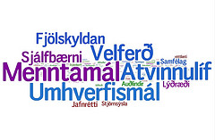
By the end, we had some nice clean data along with weighted values for each. To make a quick visualization to put-up on the big screens during the event, we threw the terms into wordle.net to make some word clouds. We did this a few times during the event while we were being bombarded with thousands of terms. It was quick, easy and impressed the crowd. We also created some basic statistical comparisons between the percentage of males and females at the event, the age and geographical break-down and how that compared to percentages at the national level. Some areas were under represented by 50% some over represented by 130%. These were important, but simply put into graphs they were eye candy to show-off the scale of participation.
Once the event ended, it still took several more days to enter all the data. Ever since data.gov launched, everyone has been on an open data, transparency kick. This is a great thing, because it allows for anyone to peek into the results and interpret it in new ways. The website thjodfudur2009.is has links to all the raw data in both XML and JSON formats collected from the event.
The ability for anyone to examine the data reminds me of a quote from the movie Contact. NASA is giving Dr. Eleanor Arroway a cyanide pill when they tell her that she should keep this, not for the reasons they CAN think of, but for all the reasons they CAN’T. That really stuck with me, because having open data freely available to use by others is good not for all the reasons you can think of, but for all the reasons you can’t. Having the data available for anyone to look at and apply their ideas to opens the world up to a much larger audience and helps break out of the group thinking mentality (especially in such a small country as Iceland).
The CLARA team took it upon themselves to create something interesting with the data from Þjóðfundur to be used in a short presentation we had later that week. We had about two and a half days to massage the data into something insightful.
The plan was to somehow use the values and weights from the aggregate information and match them against another data set. This would allow us to see how much overlap there was between the two. Originally, we planned on comparing the ideals discussed at Þjóðfundur and the discussion in the local news. If you strongly believe in these ideas, we could present some recommended reading of articles and media sources which had a high percentage of overlapping terms. While that was an interesting idea, after a bit of discussion, we found a better data set to work with. The Icelandic Parliament Alþingi! It has an XML version of the transcripts of public sessions of parliament which became our second data set to compare too.
The first step was to extract all the text from the Alþingi transcripts and save what was spoken by whom. To save time and as a proof of concept, we only extract the previous 30 days transcripts from Alþingi. This was pretty straight forward. The next step was to convert and lemmatize all the text to a format that is easier to work with and remove all stop words. Now we had a core set of words and weights from Þjóðfundur and a core set of words and weights spoken by each member of parliament in the previous 30 days.
Using some basic maths we counted the number of times words appeared in both data sets and divided by total words spoken, just in case someone said very few words, but over lapped a high percentage of them, versus someone who actually matched more times, but was dwarfed by longer speeches and the total amount spoken off topics as well.
The result of these computations was a massive spreadsheet listing each member of parliament, their region in Iceland, their political party, and word counts. We not only broke it down by total words matched, but also words matched for each of the nine categories discussed at Þjóðfundur.
We now had a new lexicon to work from when building relationships. We took the original open Þjóðfundur data, the open Alþingi data and meshed them together to form a new previously non-existent data set. The visualizations that follow were created based on this new information source.
We did not inject any of our own biases for one political party or another, this is data matched purely from two separate data sources and the equations and methodologies were applied to every calculation. Another thing to consider is that 30 days of Alþingi is not actually as much data as you might assume. Had we run this over larger data sets, month or years of transcripts it would both take longer and the data would become more statistically reliable, but as a first pass it does produce some very interesting results and opens-up more possibilities for future work.
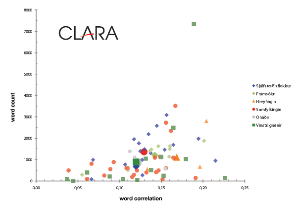
The highest correlating parliamentarian was Lilja Rafney Magnúsdóttir with a value 0.22561. This is partly because she only said 166 significant words in the 30 day window. The man with the most spoken words, over twice as many as the next person, was Steingrímur J. Sigfússon. He actually spoke many more overlapping words than Lilja, but also spoke plenty of other words that had nothing to do with the values from Þjóðfundur, so his overall correlation value is 0.18840. This causes a small problem because you can always make statistics lie in your favour. If your representative isn’t first in correlation, then they might be first in words spoken, or most correlating words, etc. Not to pick sides and to try and be as unbiased as possible, we just tried to represent the data to get the discussion started.
One good way to display these multiple competing values is on a matrix of words spoken by word correlation.
As you can see the outlier at the top of spoken words is Steingrímur, but he doesn’t have the highest correlation, that was Lilja at the far right and at the bottom. Overall, when you average all the values of the party members together you get a pretty tight clustering, represented by the larger icons mixed in. We looked into averages, quartiles and minimums and maximums for each party and the outliers quickly disappear.
Another aspect that we looked into was each of the nine categories discussed at Þjóðfundur. One was education, so we sorted the spreadsheet on who had the highest correlation between words spoken in parliament related to education and words from the education theme discussed at Þjóðfundur. We found that Katrín Jakobsdóttir had the highest correlation, which is good because she is the education minister.
Using this analysis it could be possible to see which parliamentarians are the most active on various topics and allow for better selections to be made for special committees. It can also be used to track and keep politicians truthful to what they said. If someone claims to be a strong advocate for education, but ends-up in the lower 25% percentile in parliament, can you really believe them? People forget over time, but transcripts and mathematics don’t.
We’ve only begun to dig into these data sets and are constantly thinking-up more ideas to reuse and analyze it. In the future, we can use the same software to look at other slices in time. The 90 days before Þjóðfundur compared to the 90 days after. Did politicians jump on the bandwagon to appease their constituencies? Did the categories from Þjóðfundur just become buzzwords that every politician spouts to seem closer to the people before reelection? Or maybe nothing will happen and it will continue, business as usual. No matter the outcome, the data has a story to tell.


