Sadly, Dopplr has shutdown and with it their blog. We’ve referred to this blog post so many times that we dug it out of the web archived and posted it here. It has influenced many of our articles, ideas and projects.
Originally published: October 23, 2007 – 4:24 pm, by Matt Jones
We get asked a lot about the colour-coding we give to places in Dopplr: what it represents, why we did it, how are the colours assigned.
One of the main ‘atoms’ of Dopplr is unsurprisingly, place – so to make that run through the warp-and-weft of the user-interface, and our branding, was extremely important.
The Dopplr logo, (or ‘SparkLogo’* as we sometimes like to call it) is the clearest example of this perhaps.
As you add trips to different destinations, Dopplr’s logo becomes your logo, reflecting what you’re doing – right the way through to the ‘favicon‘ that shows up in the address field of most browsers.
It also makes for a great blog badge…
As well as the aesthetic delights we believe that city colours bring to the service, we’re using them as visual ‘affordances‘ – ways to create implicit meaning and usefulness in the user-interface.
When you look at a list of your fellow travellers, you’ll see a coloured border around their icon, which correlates to their current location – allowing you to spot coincidences visually.
We’re going to be doing far more with the city colours to create affordances in the near-future… But how do we generate them? What’s the basis for making London a fine electric cyan, or San Francisco a rather-fetching coral pink?
For that I transfer you across to The Other Matt.
Here comes the science bit!
We wanted a deterministic RGB colour value for each city. At first, we tried mapping the latitude and longitude of a city to a point in colour space, but we found that this made neighbouring cities too similar in colour. This means that people who travel frequently between Glasgow and Edinburgh wouldn’t clearly see the difference in colour between the two. Also, since so much of the Earth’s surface is covered in water rather than cities, it leads to a sparse use of the potential colour space. In the end, we went with a much simpler approach: we take the MD5 digest of the city’s name, convert it to hex and take the first 6 characters as a CSS RGB value.
So there you have it. When we struck upon the idea of doing this a couple of weeks into developing Dopplr, it was a huge source of delight to us, and we hope it is to you too…
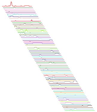
Illustration: Work-in-progress by Stamen’s Tom Carden using the Dopplr API
—-
* We call it a ‘SparkLogo’ as tribute to information-design-guru Edward Tufte’s concept of “Sparklines” which we also use as a device for visualising information elsewhere on the service e.g. on the detailed trip pages.