A note to put things into historical context for our future selves. Week #267 was a short one with all the Easter Holidays, so we didn’t manage to get as much done as in a normal week. It was also the week that Apple released their iPhone SE (special edition). Many flags at half-mast this week, plus the passing of Garry Shandling at the age of 66.
It has been the Spring Equinox in week #267 meaning that here in Iceland, being so far north, we are getting around 50/50 light/dark hours each day. The trend for more or less daylight follows a sin-wave. The troughs and peaks are the shortest and longest days where the equinoxes are in the middle ascending or descending. Which means that we are gaining around 8-10 minutes of extra sunlight each day. Over the course of a week, that is around 45 more minutes. This time of year it is a very noticeable change.
These last two weeks have been pretty busy. We’ve been wrapping a project for the O’Reilly Strata Conference in San Jose in Week #268. We’ve been building three 3D data visualisations for them to work in a Virtual Reality environment.
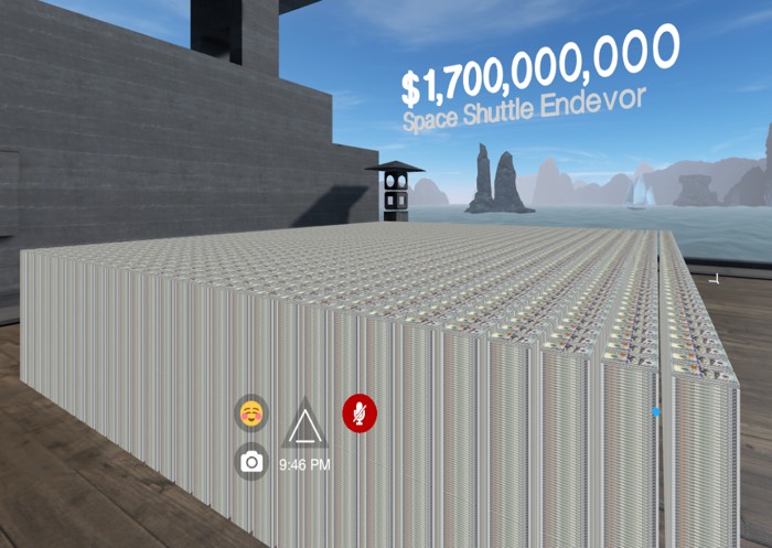
The three that we have designed take steps slowly into more and more interaction. The first is an animation showing volumetric sizes of piles of $100 bills. The difference between $1,000,000 and $1,000,000,000 is only three little 000s, but the physical size of $1 million dollars in hundred dollar bills is smaller than a brief case. $1 Billion, on the other hand, is 100 times larger and takes-up considerably more space! Actually being able to walk around these amounts is quite impactful.
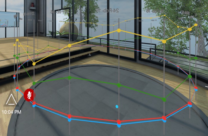
The second example is what we’ve been calling Data Henge (I know it’s not a henge). We wanted something to show you in the round, all 360°. We wrapped a line graph of stock data around you, so no mater which way you looked you would see the data. We animated this to build slowly allowing you to peek at each node and get a pop-up of the real value. The best way to experience this visualisation is to be inside it!
The third we built has the most interactivity. We are using some data from the NYTimes article by Alan S. Blinder called A Modest Proposal: Eco-Friendly Stimulus and a concept from Bret Victor on Climate Change. Allowing people to adjust the input values themselves and see the resulting output is much better than explaining it or showing them the equation. Saying “Why not just double your budget to make it better”, well, now you can try it and see the impact. Maybe you won’t get twice the desired output. Fiddling with the knobs allows you to experiment and find an equilibrium that you are happy with.
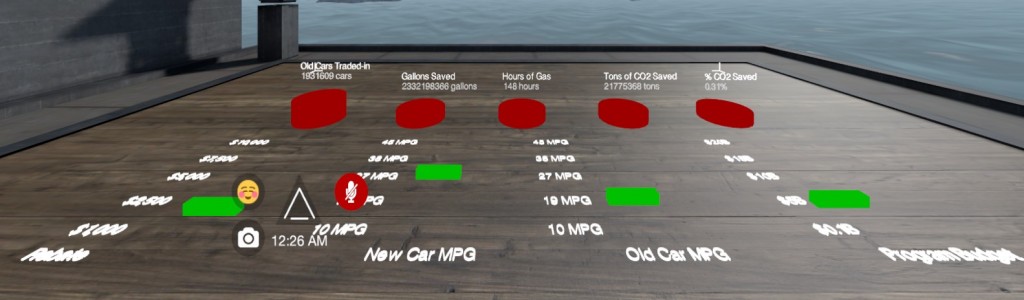
An early prototype for manipulating the variable. Inputs in green outputs in red.
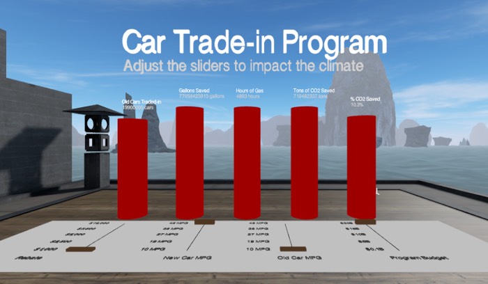
Closer to the final version. The sliders are more like sometime you’d see on a music mixing board.
Bric-à-brac
Having been to a few Muji shops, they are a minimalist, zen IKEA. It doesn’t surprise us what they have come-up with in attempting to recreate iconic Tokyo locations with items from their store.