In a previous article, I created a world map in the HLS color space based on the latitude and longitude of the city names. I also demonstrated two different ways to deterministically create a unique color for a city name. The first was based on a hash of the location name and the other on the geolocation. There are plenty of other algorithms that could be used, but I focused on those two. The downside of giving yourself over to the algorithm completely is that you will sometimes get very light colors and other times very dark. The output you receive will run the full range of possible colors and you need to be prepared to deal with them in your design. To handle the unexpected, the function that returns a unique color needs a friend. This friendly helper algorithm will return black or white, depending on which has the higher contrast with your color.
There are a few ways to determine the level of contrast between colors. In this article, I will examine three. They are easy to implement and all produce similar results. It isn’t a matter of which is best, but more the fact that you are using one at all!
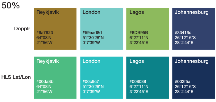
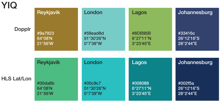
Let’s have a look at four locations, Reykjavík, Iceland, London, England, Lagos, Nigeria and Johannesburg, South Africa. When we run these places through both the Dopplr and the HLS Lat/Lon algorithms you see that we get different colors. The Dopplr colors are nice and unique based on a hash of the location name, but don’t tell you any additional information. The HLS Lat/Lon are based on the location therefore the results are getting darker and darker as you move southward. They are also shading from green to blue as you move eastward.
Now that we have colors for each location we need to find out whether any accompanying text should be white or black based on which has a higher contrast.
There are three functions I want to compare. The first I will simply called 50%. This takes the hex value and compares it to half-way between pure black and pure white. If the hex value is less than half, it returns white, if it is more than half it returns black.
function getContrast50($hexcolor){
	return (hexdec($hexcolor) > 0xffffff/2)?'black':'white';
}
It doesn’t get much simpler! It is easy to remember, but is naïve when it comes to understanding how we perceive parts of the spectrum. Different wavelengths have greater or lesser impact on the contrast. The second equation is called YIQ because it converts the RGB color space into YIQ which takes into account the different impacts of its constituent parts. Again, the equation returns white or black and is also very easy to implement.
function getContrastYIQ($hexcolor){
	$r = hexdec(substr($hexcolor,0,2));
	$g = hexdec(substr($hexcolor,2,2));
	$b = hexdec(substr($hexcolor,4,2));

	$yiq = (($r*299)+($g*587)+($b*114))/1000;

	return ($yiq >= 128)?'black':'white';
}
You’ll first notice that the hex value has been broken down into the RGB values separately. This is important because each of these channels is scaled in accordance to their visual impact. Once everything is scaled, it will be in a range between zero and 255. Much like the previous 50% equation, we now need to check if the input is above or below half-way. Depending on which section it sits in, we’ll return the corresponding higher contrasting color.
The third function deals with luminosity, which is the brightness of the color.
function getContrastL($hexcolor){
	$r = hexdec(substr($hexcolor,0,2));
	$g = hexdec(substr($hexcolor,2,2));
	$b = hexdec(substr($hexcolor,4,2));
$l = ($r*0.2126)+($g*0.7152)+($b*0.0722);
return ($l >= 128)?'black':'white';
}As you can see, we broken down the RGB into it’s constituent parts and applied slightly different scaling values. The resulting value is again between zero and 255, so we compare half-way to find the maximum contrast.
That’s it, three simple contrast equations which work really well to determine the best readability.
The W3C has a few documents about color contrast and how to determine if there is enough contrast between any two colors. Particletree wrote-up their experience with choosing light or dark themes in their products and Jonathan Snook created a color contrast picker which allows you to play with the RGB sliders and get values for YIQ, contrast and others in return.
If we go back to the cities list and their color swatches let’s see what color we should be using for maximum contrast based on the equations.
If we use the simple 50% contrast function we can see that it recommends white against all the colors except the first three Dopplr results. The equation feels these are too light and that black is a better fit.
The more complex YIQ and Luminosity functions, with its weighted colors, had identical results for these colors, but they were a slightly different suggestion than the 50% function. The very dark colors still get recommended white text, but there are some surprises. The brown Reykjavík is recommended as white rather than black. The two lighter colors in the HLS lat/lon result are also inverted compared to the 50% results. These equations feels that the hue is too light and that black has the most contrast.
As you can see the two contrast algorithms agree most of the time. There are some instances where they conflict, but overall you can use the equation you like better. I don’t think it is a major issue if some edge-case colors get one contrast over another, they are still readable, the maximum readability will always be debatable.
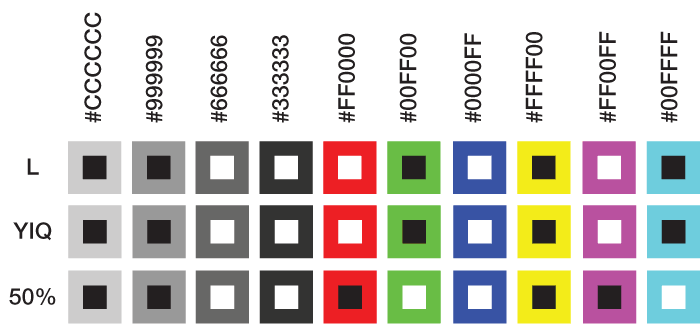
Rather than pull some edge-case city colors, let’s look at some common colors and then see how the three functions compare. You can quickly see that they do pretty well across the whole spectrum. Again, salt to taste.
In the first few shades of grey, the white and black contrasts make sense, but as we test other colors in the spectrum, we do get some unexpected deviation. Pure red #FF0000 has a flip-flop. This is due to how the YIQ function weights the RGB parts. You might have a personal preference to one style over another, both are justifiable.
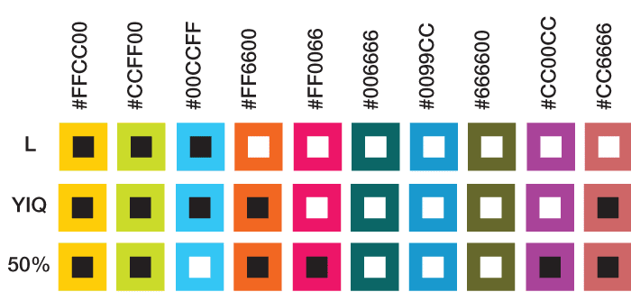
In this second round of colors, we go deeper into the spectrum, off the beaten path. Again, most of the time the contrasting algorithms are in sync, but every once an awhile they disagree. You can select which you like better, neither of which are recommending a bad combination.
If you are dealing with large data sets and take the hands off approach to selecting unique colors, then you are going to need to be aware of contrast. You now know at least three different ways to determine when you should be using white or black as a complimentary color. There is no excuse to create a better experience for your customers, avoid confusion and make it pleasing on the eyes. Sure, there are plenty of other color and contrast generating algorithms, but this was just an introduction to show how easy it can be to provide better defaults to your customers.


